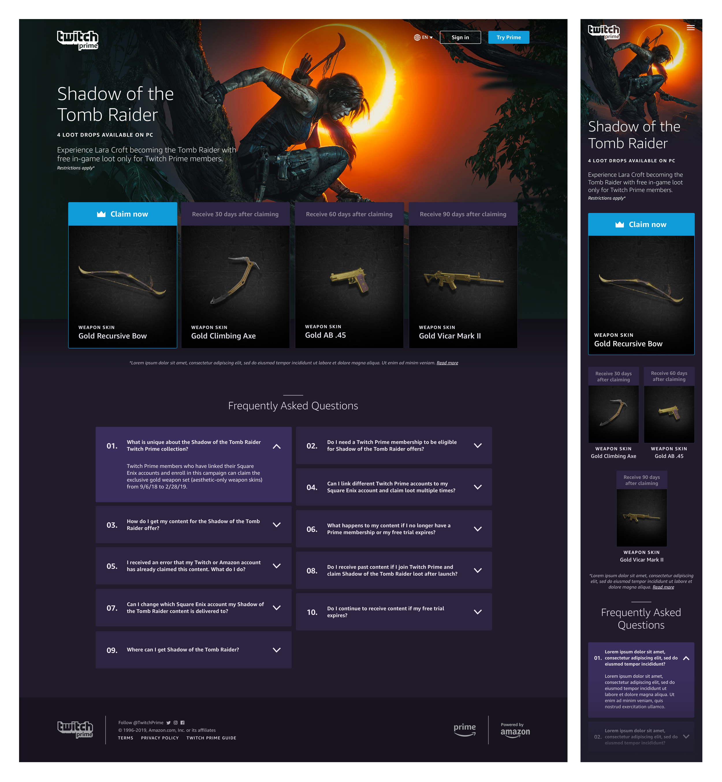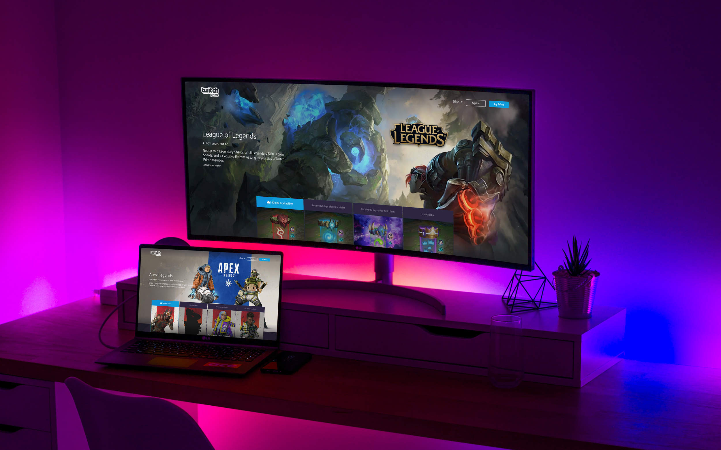
Leveling up Twitch Prime with more powerful detail pages.
My Role
UX Designer
Scope
Twitch Prime offer detail pages
Skills
UX, UI, product design, web, mobile, prototyping, usability testing, competitive analysis, customer obsession
2018 - 2019
Since launching this project, Twitch Prime rebranded to Prime Gaming. The info on this page is my own and does not necessarily reflect the views of Amazon or Twitch. Certain metrics omitted.
When I joined Twitch Prime in August 2018, I quickly realized the current detail page templates didn’t support the long-term needs of customers or the business. New types of offers were pushing the limits of the templates past their intended use. For Twitch Prime to scale and provide more gaming offers to customers, I designed offer detail pages which were flexible, simple, and powerful.
Spoiler alert: Offer detail pages were used by hundreds of gaming offers, including the most successful in Twitch Prime history.
When offer detail pages launched, they quickly caught on. For the next 4.5 years, hundreds of Twitch Prime offers successfully launched on my offer detail page template. The most successful offers in Twitch Prime history used offer detail pages, including Grand Theft Auto Online, League of Legends, Red Dead Online, Apex Legends, and Nintendo Switch Online. During their use, offer detail pages successfully met the needs of customers, supported new offer types, satisfied the goals of game developer partners, and helped the business scale. Continue below to learn how I created them.
Check out the next evolution of offer detail pages in my newer case study: Prime Gaming detail pages.

Twitch Prime is a set of gaming benefits included with Amazon Prime.
Defining the product launch process
When I joined Twitch Prime, it only existed for 2 years. It was basically a startup within Amazon. The team was scrappy and experimental, but there were lots of opportunities for ownership and impactful improvements. I immediately discovered that UX designers weren’t very involved in the initial product definition phase. (I was 1 of only 3 UX designers in the org at the time.) UX designers were seen as people who “make mocks” or “make things pretty” and would only jump in when the PM wrote user stories. I empathized where that misconception came from because most people usually only saw the end product. So, I took it upon myself to slowly shift the culture to have UX more involved in the early phases—including working backwards from customer needs, defining the “why”, determining the opportunity statement, ideation, brainstorming, usability testing, and prioritization. Below was the product launch flow I created for Twitch Prime that shifted how involved UX was across all four phases and I used it for offer detail pages.

My design process, at the time
As a UX designer, it was my job to advocate for the customer in everything I did and design delightful, functional experiences that helped them accomplish their goals. I needed to empathize regularly with customers, internal stakeholders, and help reach business goals. At Amazon, the first leadership principle is customer obsession. It is everyone’s responsibility to obsess over customers at Amazon and I enjoyed having that be my full-time job. No one was going to question why I was listening to customers so much. And I knew that without a clear understanding of customers, the chances that a product was successful greatly decreased.
Phase 1: Why?
The first phase of my design process was to clearly define the opportunity to create value for the customer. It was important that no solutions were defined during this phase so that I could focus on the customers’ needs and motivations. I started with deeply understanding the customers, the current state of detail pages, and the problems that needed to be solved. A final "how might we" opportunity statement set the groundwork for creative ideation and inspired product design.
Opportunity: Offer Detail Pages
Current State
What’s the current customer experience? How are customers getting value today?
At the time, Twitch Prime had “Amped” pages with two templates: one limited to only 3 loot drops and another with multiple drops available once a month.
Issues with the Current State
What are the problems with the current state that need to be solved?
Current Amped pages for Twitch Prime offers didn’t support the long-term needs of customers and game developer partners.
New types of offers (retention-based, subscription, etc) were pushing the limits of these pages past their intended use.
Amped pages also had a number of usability issues that needed to be addressed. They lacked clarity and had a confusing layout which focused on advertising other offers and Twitch Prime, rather than keeping the focus on the game.
Additionally, Twitch Prime was prioritizing retention, growth and scale—goals Amped pages couldn't satisfy.
Thus, a new detail page system was needed to scale the business and provide more offers for customers.
Opportunity Statement
The problem statement, vision, the “North Star”; this statement expresses where value can be created for customers. This statement doesn’t suggest what we should create, just why.
How might we create the best experience for customers that allows for flexibility to add more value?
Watch above: The Amped page templates + a clip of a customer’s sentiment towards the Amped pages during a usability study.
Customer goals, pain points, and needs
Before coming up with solutions, I needed to deeply understand the customers, and I mean all types of customers. I was curious what frustrated them, what were their goals, wants, needs and pain points. These would be the problems I needed to solve to make a valuable experience. I reached out to peers from business development, content, operations, marketing, and product and talked to anyone who was willing to help me better understand customers.
Customer #1: Prime Members & Video Game Players
Customer Goal: Find new games to play and enjoy the games I already play a bit more with in-game loot included free with Prime.
Customer Pain Points:
Confusing experience
Messaging in unclear
Purpose is unclear
Customer Needs:
Improve customer experience
Simplify the claim flow
Clarify messaging
Customer #2: Game Developers & Publishers
Customer Goal: Promote my games and offers to acquire new players or re-engage lapsed players.
Customer Pain Points:
Poor onboarding and intake
Lack of control
Not enough flexibility
Customer Needs:
Simplified operations
More innovative features
Flexibility of components
Customer #3: Twitch Prime Business & Operations
Customer Goal: Flexible detail page templates to scale the business and reduce operational costs so we can provide more offers to Prime members.
Customer Pain Points:
Not flexible for offer types
Lack of creation process
Inconsistent branding (trust)
Customer Needs:
Simplified creation process
Improved operations and standards
Cohesive Amazon, Prime, Twitch branding
Competitive analysis
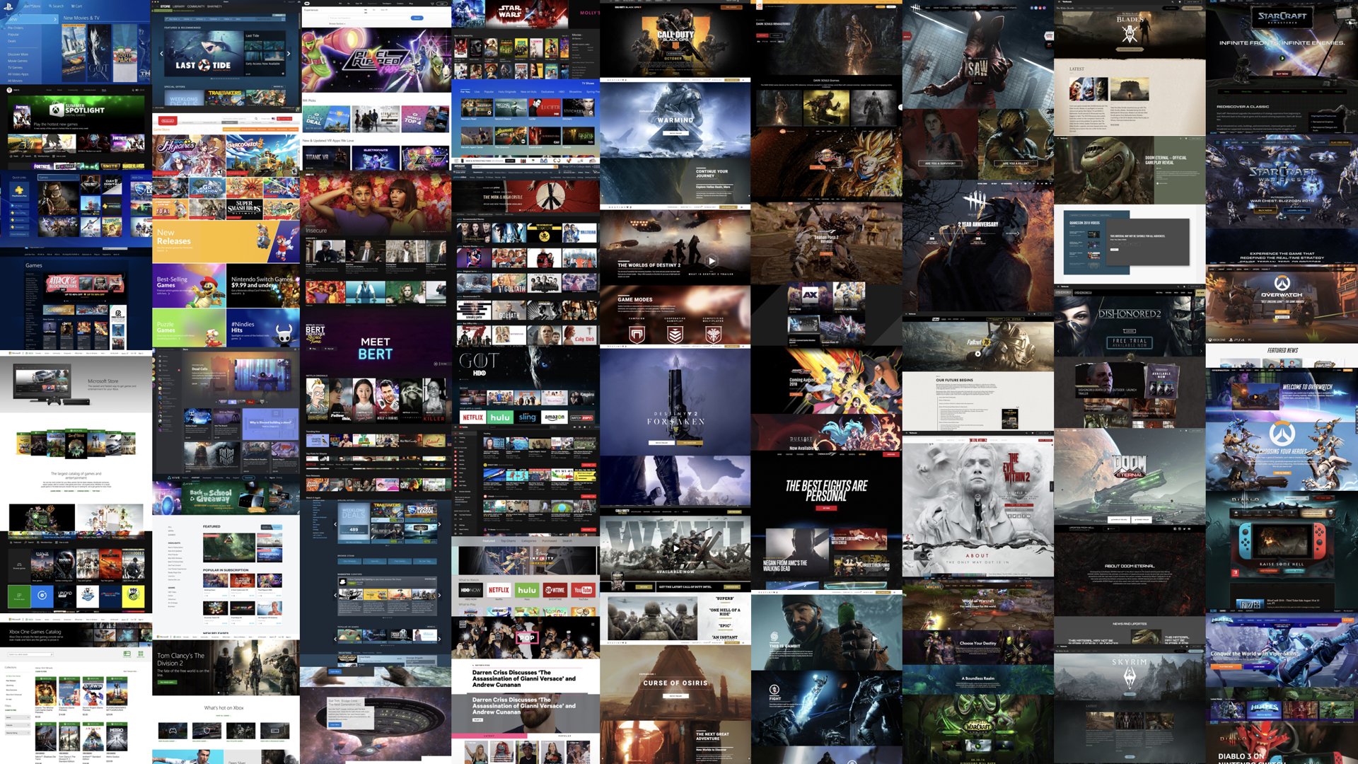
To truly understand what customers were used to, I scoured the web to record all game stores, streaming sites, and game sites in order to conduct competitive analysis and inspiration gathering. It was my most comprehensive competitive analysis ever where I captured 124 websites. Then I analyzed each of them and documented likes and dislikes in order to reuse some of the best patterns and avoid any not-so-great features.
Phase 2: What?
During the next phase, I started designing in low-fidelity so that I could work quickly and come up with many ideas. Low-fidelity ideation was an important tool to gain early alignment with stakeholders before diving into high-fidelity.
Sketching & inspiration gathering
I first started sketching on a whiteboard to iterate quickly, sometimes with other designers, then I started coming up with more concepts alone in my sketch pad. I shared my sketches and ideas with the PM and other designers to get their early feedback on my design direction so far. Simultaneously, I started gathering inspiration I found on Dribbble and across the web that would influence my designs.
Design ideation
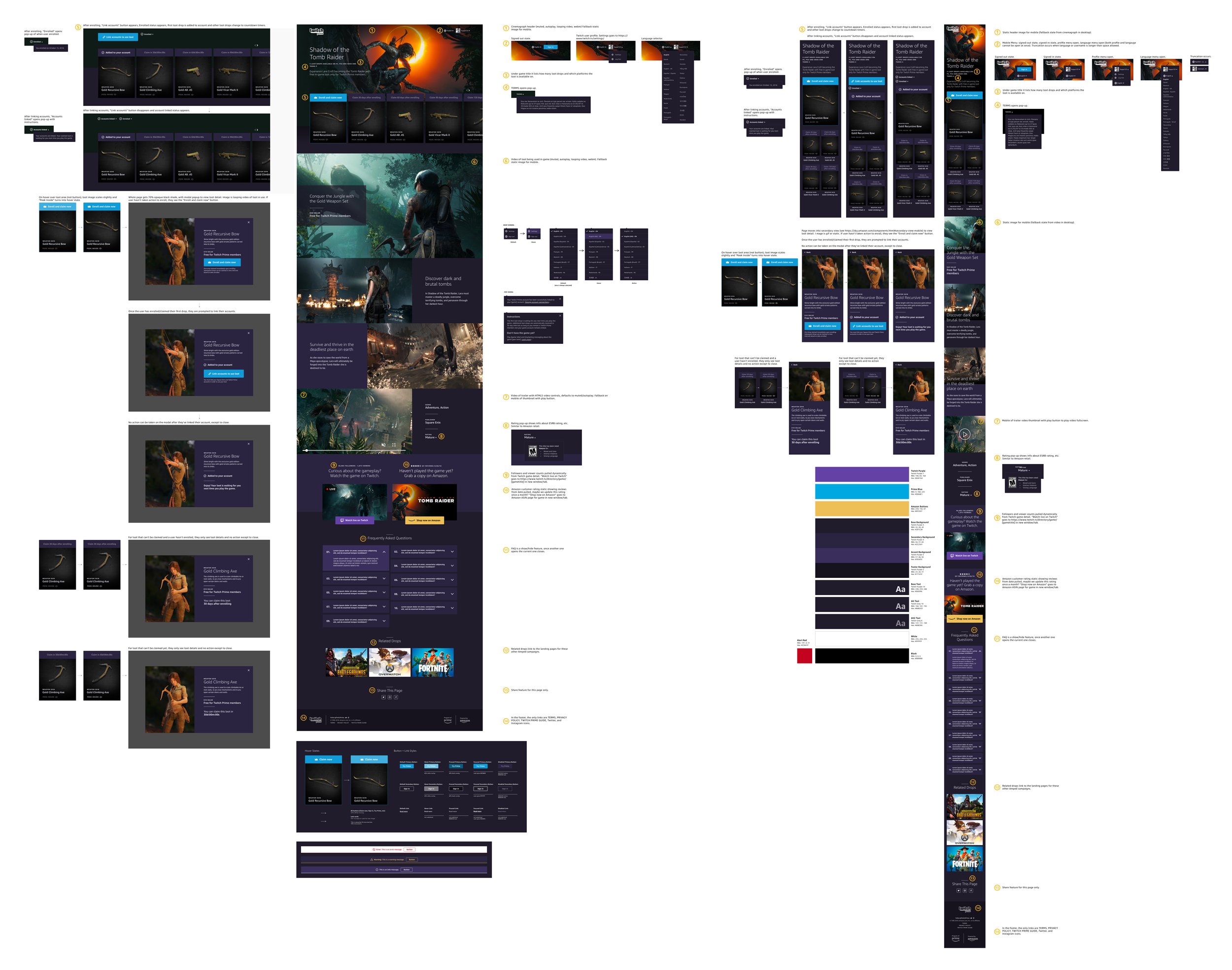
From my sketches, I then created wireframes from my ideas. Once I had a solid concept and my stakeholders and I aligned on a direction, I began creating high-fidelity mocks which drove many additional design decisions.
Design proposal
I put together a design proposal that outlined the user flow, color palette, and my first-round high-fidelity mocks with their features and components outlined. I shared this proposal with more stakeholders such as the PM, other designers to get their feedback, and the engineering team to understand what’s technically feasible.
Claim flow
One of the issues with the existing detail pages was the confusing and frustrating process customers’ had to go through in order to claim loot (e.g. sign up for Twitch Prime, claim offers, link accounts). I sought out to improve clarity in the steps we had control over (linking accounts still required customers to be taken to third-party websites). The claim flow, outlined below, varies slightly between different offer types and account linking integrations. Regardless of the variables, only Prime members can claim offers.
Phase 3: How?
During the final “how” phase, I worked with the PM to prioritize the offer detail page features from my high-fidelity mocks, I prototyped the experience, I ran usability testing, and I eventually handed off my designs to the engineers.
Component breakdown and prioritization
When I was in the ideation mindset earlier, I tried to solve as many customer problems as possible by creating the ideal future version regardless of what was easy or hard to code. Once I had a solid ideal design, I worked with the PM to pair it back into phases of development. I first categorized each part of the page into flexible components, then the PM and I prioritize each component based on the following criteria:
P0 = Content already on the current detail page templates + requirements for retention offers
P1 = Content we didn’t have on the current detail page templates, but would improve the customer experience
P2 = Value-add components and rich media content
Prototyping
Once the PM and I had a solid plan, I started prototyping my concept. For prototypes that needed video for a study, I used Principle (see video below). Otherwise, I used InVision. I conducted three studies using my prototypes to observe initial customer reactions and test usability.

Study: Old Amped Pages vs. New Offer Detail Pages
Format: Remote unmoderated interviews
Role: We had no UXRs at the time, so I did this study on my own
What I wanted to learn: Observe if participants' initial first impressions were more positive for offer detail pages because excited customers were more valuable to Twitch Prime and represented people more likely to sign up and/or claim the loot. Half of the participants viewed an Amped page and the other half viewed a new offer detail page while being asked the same questions.
Study Results
Participants expressed a feeling of excitement and encouragement to sign up for Twitch Prime and claim the loot when viewing and exploring the offer detail page version.
Participants described the offer detail page as “attention-grabbing”, “organized”, “detailed”, and “very easy to understand”. This excitement and clarity wasn’t expressed by participants who saw the Amped page.
The Amped page was described as “advertising” and “chunky” with mostly negative first impressions by participants and a noticeable confusion over the main purpose of the site.
Recommendations: Continue to invest in offer detail pages and their design and consider deprecating Amped pages. This was the first time Amped pages were ever tested with customers; this test exposed how confusing and bad they were which can hurt the business and hinder the experience of current and potential customers.
Study: P0 Offer Detail Page Usability
Format: Remote unmoderated interviews
Role: We had no UXRs at the time, so I did this study on my own
What I wanted to learn: Understand if the P0 version of the offer detail page (the version we planned on launching with) presented the in-game loot in a way that was easy to understand and claim.
Study Results
All participants had positive first impressions when viewing the page, describing it as “very clean”, “professional”, “visually appealing”, and “intriguing and inviting”.
All participants were able to accurately describe the purpose of the page.
Multiple participants expressed confusion about the "Enroll and claim now" step and the the second step of linking accounts.
Participants inaccurately assumed "enroll" meant signing up for Twitch Prime and “linking accounts” meant linking their Amazon Prime and Twitch accounts, deeming the second step unnecessary.
Note: “Enroll” was supposed to mean enrolling in the retention-based offer where customers would receive loot automatically over time. “Linking accounts” was supposed to mean linking your Twitch Prime and game accounts to receive the loot.
Recommendations: The overall design and general layout of the page should remain the same due to the participants' positive reactions. Improve the clarity in the enroll, claim and linking steps customers need to take in order to claim loot.
Study: P2 Offer Detail Page Rich Media Sentiment
Format: In-person moderated study with recruited Amazon employees who had various gaming profiles and various levels of Twitch Prime awareness
Role: I collaborated with three other designers on this study
What I wanted to learn: Observe if the additional components and rich media on the P2 offer detail page impacted users' attitudes, behaviors, and motivations towards claiming in-game loot.
Why was this important: People who play video games expect immersive, high-quality visuals in the games they play and current Twitch users on average spend 95 minutes a day consuming video. These expectations and habits were not represented on current Amped pages which lacked rich media such as videos, animations, and high-quality visuals.
Study Results
All participants had positive reactions to the rich media on the page.
Referring to the animation at the top, participants said it “feels like you are part of a video game experience” and “it’s aesthetically pleasing”.
One participant even tried to set the animation as their desktop background because they liked it so much.
Referring to all of the videos on the page, participants said it made them “feel excited” to play the game and get the loot.
Recommendations: Continue to invest in P2 rich media components for offer detail pages so that they excite current and new Twitch Prime customers to sign up and claim loot.
Video of my P2 prototype that I built in Principle.
Revised P0 Prototypes
After learning so much from my three studies from customers and feeling more confident in my decisions, I revised my P0 designs then handed it off to the engineers who I worked closely with, along with QA and Content teams, to get it ready for our first launch.
Partner Guidebook
For efficient onboarding for external partners and intake for the internal content team, I created a Partner Guidebook PDF to make sure offer detail pages had the best experience for customers. This also included a Photoshop template that auto-generated image assets and a copywriting tool. To create these tools, I collaborated with content and marketing teams. The Partner Guidebook allowed Twitch Prime to scale and more easily standup detail pages. I continued to maintain the guidebook over time and conducted walkthroughs to educate new content and marketing peers on how to use it with their partners.
Impact and influence
The patterns and components I designed for offer detail pages became the first parts of the Twitch Prime design system, called “Carbon”. I helped create an early version of the Carbon design system library which set new interface standards for the rest of Twitch Prime. Also, yay dark mode!
Getting feedback from game developers
Up until this point, I had only reviewed my offer detail page designs with other designers, stakeholders, and video game players. I wanted to get some feedback from another key customer: game developers and publishers who would represent their games and offers on these pages. So the team met with EA and Respawn during GDC. After asking their marketing, campaign, and business development owners what they might want on offer detail pages and what they think their players' needed, their input was followed by a peak into a future P2 prototype (see video below). I successfully anticipated their needs because 80% of their requests were covered by features I already designed.
“Overall, [their feedback] was VERY positive and I wanted to give you a specific call out. You’re judgement on design/marketing features was right in line with EA and Respawn desires and what they believe their players want. In fact, every feature you listed was requested and roughly 80% of their requests were covered by your features. I don’t think I’ve seen that UX ‘batting average’ before. Thank you for continuing to push Twitch Prime to have a better user and partner experience.”
— Twitch Prime Senior Program Manager

Apex Legends is coming... full speed ahead!
Launching the first offer detail page
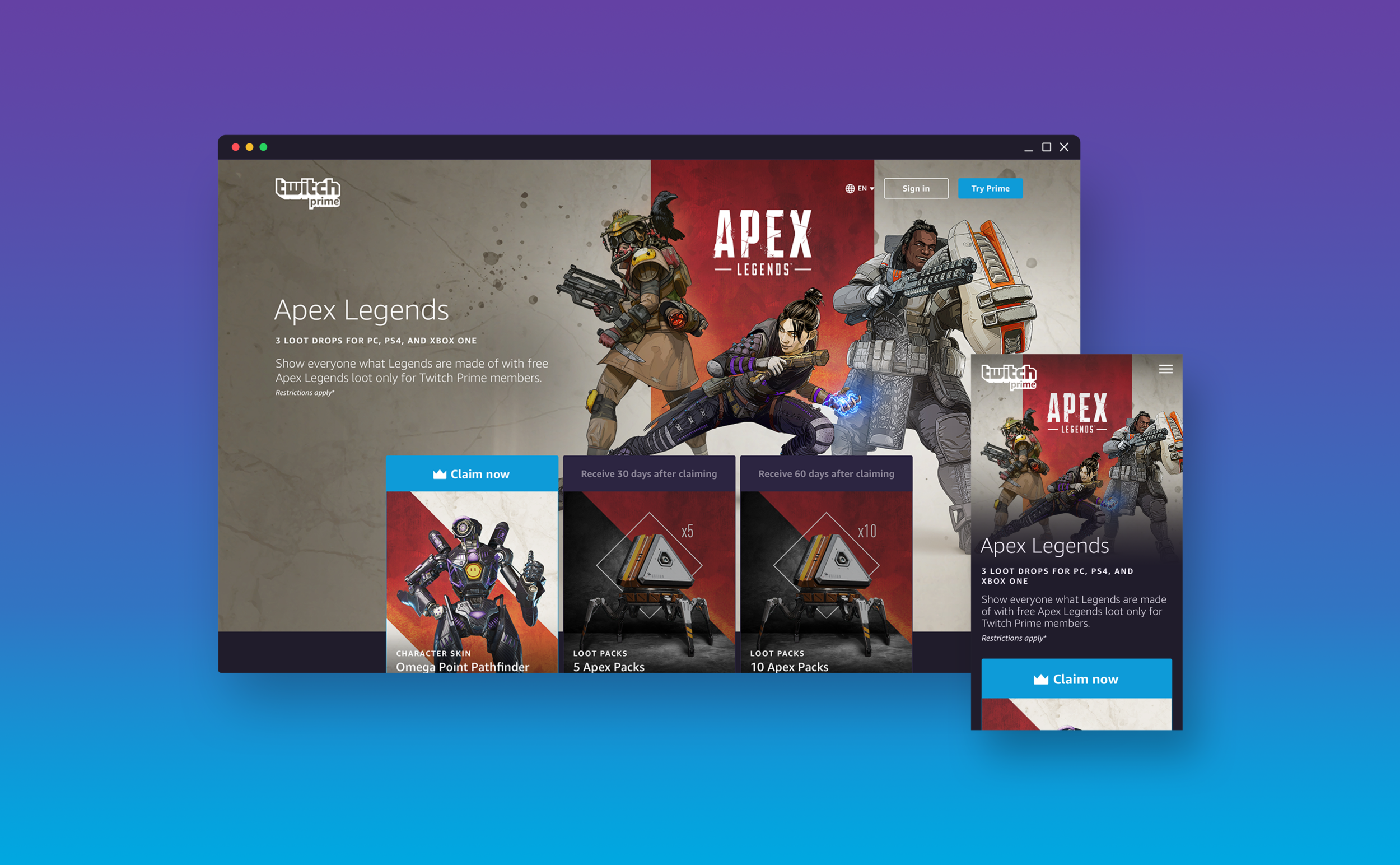
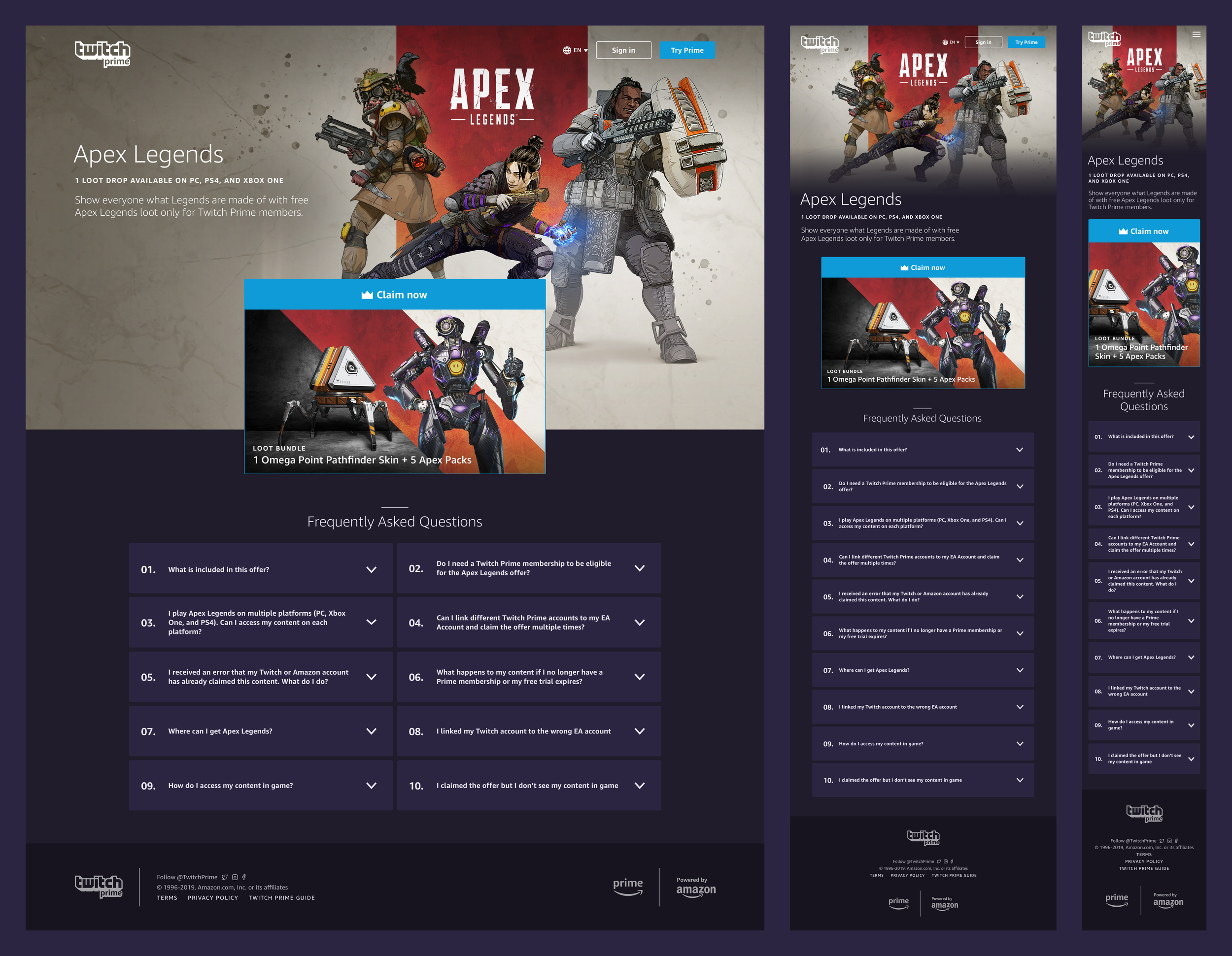
With the upcoming release of Apex Legends in February 2019, it was a no-brainer to launch the new offer detail page template for the Apex Legends offer. The game surpassed over 25 million players by the end of its first week, and 50 million within its first month. The Apex Legends offer became one of the biggest offer launches in Twitch Prime history.
Demand for more offer detail pages increased
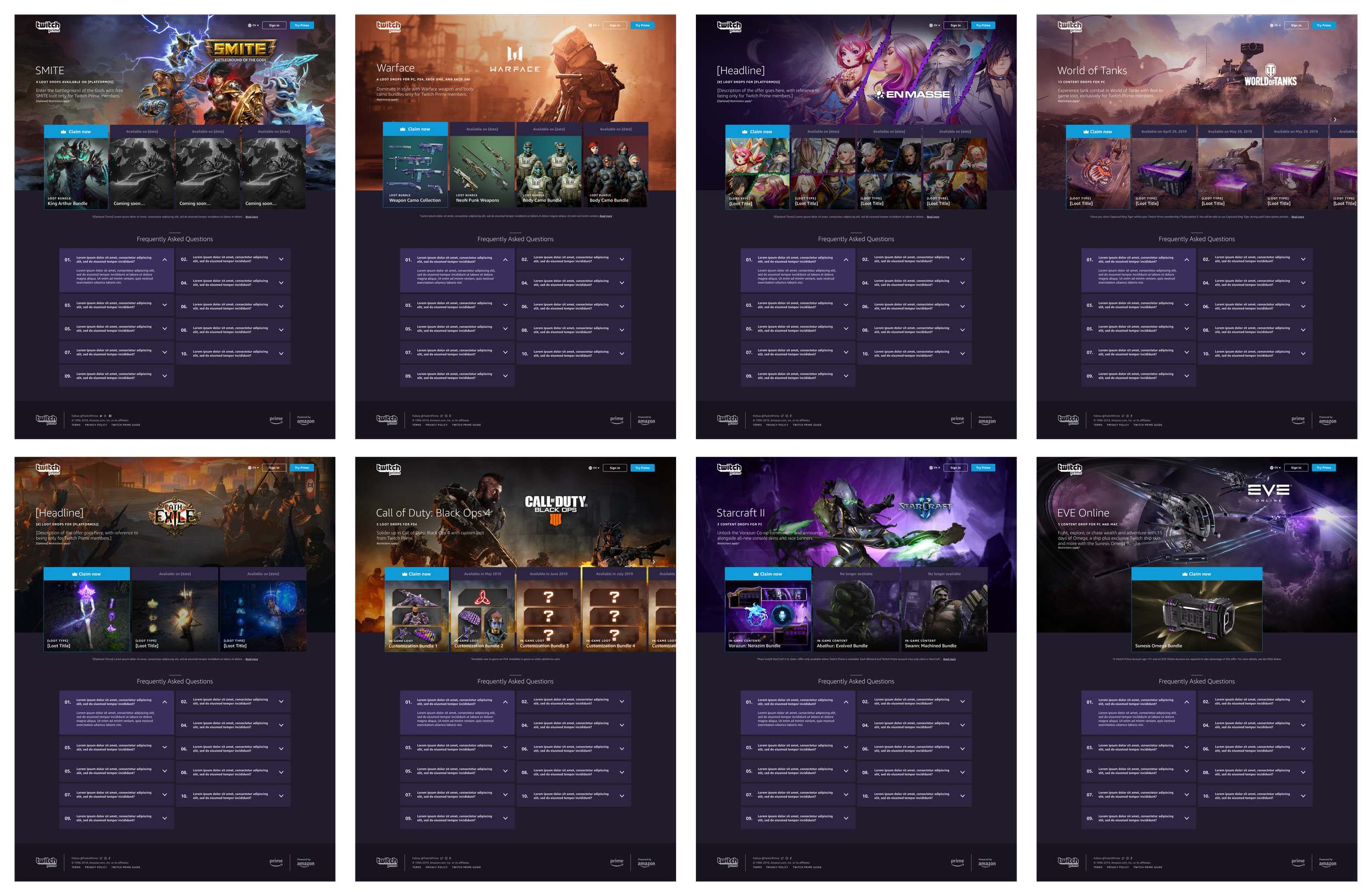
As more game developer partners saw the new offer detail pages, they started to request launching on the new template and not the old one. About a dozen offers launched on the new template within the span of two months for top games including SMITE, Warface, En Masse, World of Tanks, Call of Duty, and more. Unfortunately, launching these pages faster than we expected caused us to sacrifice some polish on the front-end. I kicked off a project with a front-end engineer to fix issues on the site. There was a team-wide interest to raise our website standards for Twitch Prime, make our code more scalable, and greatly improve the experience. Eventually, Amped pages were deprecated in favor of offer detail pages.

Twitch Prime + Nintendo Switch Online
Launching the first player-retention campaign
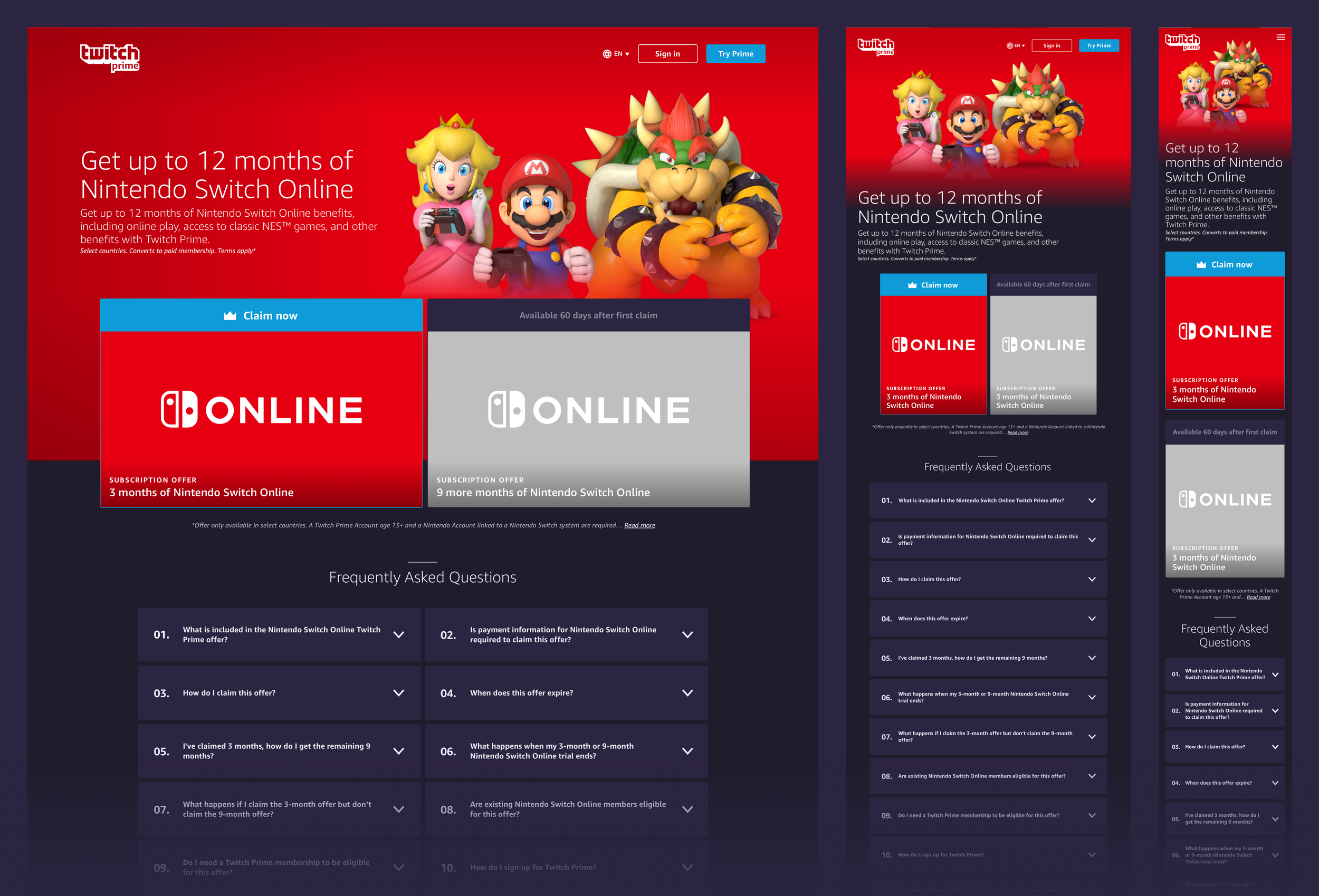
While engineers were working on building an event-based offer system based on long-term active Prime membership in order to meet retention goals, I was working on the offer detail page for the Nintendo Switch Online offer. The offer launched on March 28, 2019 where Twitch Prime members could claim up to 12 free months of Nintendo Switch Online if they redeem the 3-month and subsequent 9-month offer after 60 days of active Prime membership. This partnership garnered one of the most covered Twitch Prime offers in the press, including articles from top gaming and tech sites like Mashable, The Verge, TechCrunch, Gamespot, and Polygon. This was Twitch Prime’s first partnership with Nintendo and first retention-based offer.
My role in the launch of this offer didn't come without its own set of challenges. Not only was there a language barrier and intense review process, there were also many elements of the user flow on Nintendo's side that we didn’t get support to fix. For the months leading up to the launch, I had to continuously come up with UX solutions in order to not sacrifice a good experience for customers.
“Twitch Prime has been aggressively expanding its offerings over the past year, adding a focus on its lineup of free game offerings alongside skins and other add-ons for popular multiplayer titles.”
— Screen Rant
“Twitch Prime is working to be the best deal in gaming, and it seems that it’s well on its way to snagging that title.”
— Mashable
“For those who don't know, Twitch Prime is a service that comes free with a valid Amazon Prime account, and it packs a notorious amount of rad gamer loot.”
— Esquire

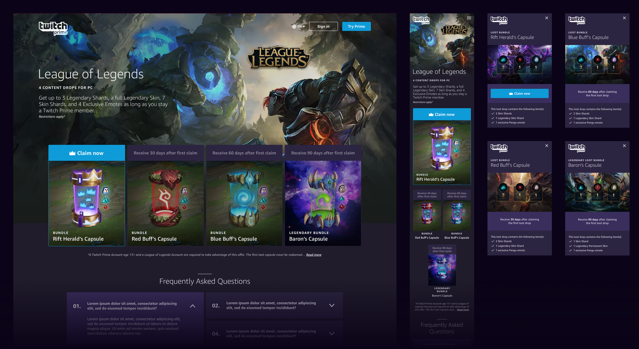
Twitch Prime + League of Legends
Starting a long partnership with the #1 game on Twitch
On Twitch, League of Legends reigns supreme. From 2016-2019, League averaged 1 billion hours watched per year and has been the #1 all-time most watched game on Twitch. We worked with Riot Games to launch the second retention-based campaign on an offer detail page. Twitch Prime has partnered with Riot Games ever since for some of its most successful offers to-date.
My role in the launch of this offer was to ensure the claiming experience was smooth end-to-end. I also created custom animated assets for this detail page and helped with their marketing assets. This was the first offer detail page that used the “item details” modal feature where you could click on each drop and see details and images of all the items included in each bundle.
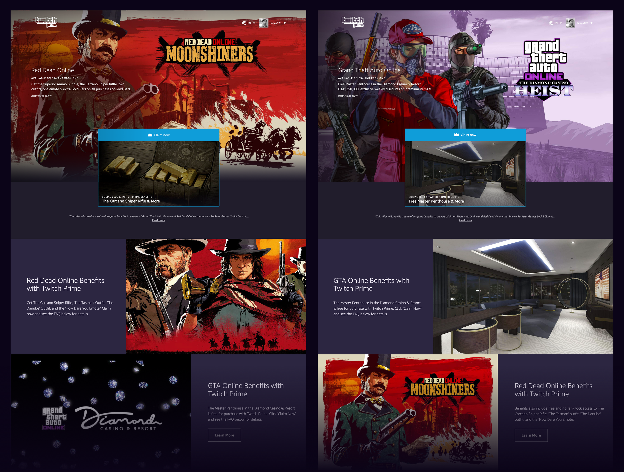
Twitch Prime + Rockstar Games
Launching a highly popular subscription offer for Rockstar Games
In the fall of 2019, Twitch Prime launched the first subscription offer, meaning customers only needed to claim it once to automatically receive monthly drops in their games as long as their accounts were still linked and they were still Prime members. This offer was for Red Dead Online and Grand Theft Auto Online (the 3rd most popular game on Twitch). This was one of the most successful offers of all-time and Twitch Prime continues to work with Rockstar Games. This was also the first time a partner used the new P1 feature ‘offer detail cards’ to cross-promote their games.
Launching additional features over time
As time went on, opportunities arose to launch new features and support new offer types. The customer experience was becoming more consistent, flexible, and powerful.
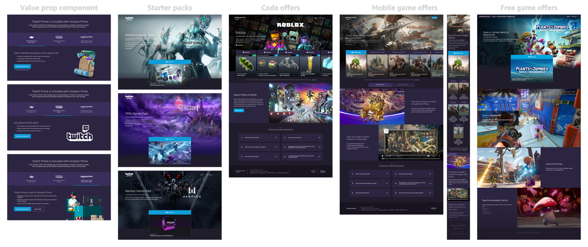
Additional features and new offer types
I designed a value proposition component that was visible on offer detail pages only for signed-out anonymous users to upsell the benefits of Twitch Prime which, when launched, resulted in more sign ups.
Launched starter packs to bring new players into games.
Removed the need for a Twitch account to claim loot and rebranded to Prime Gaming.
Moved ingestion of assets and copy into Contentful for a better self-service publishing flow for the content team.
Designed and launched code offers on offer detail pages.
Launched mobile game offers on offer detail pages.
Added breadcrumbs to the top nav to add clarity in navigation.
Added free game offers to offer detail pages which used the new P2 rich media video components to show game trailers.
Hundreds of offers launched on offer detail pages, providing more gaming benefits to customers
Over the years, hundreds of gaming offers became available to Prime members using offer detail pages. These pages became the standard, the status quo, the desired destination for gamers interested in free loot and games included with Prime. I was proud of what I had accomplished and proud of the team that I worked closely with to make these pages the best they could be within the constraints we had at the time. It was cool to see a design I made years prior take on a whole life of its own.
Results, impact, and learnings
-
Results
Offer detail pages successfully met the needs of customers, supported new offer types, satisfied the goals of game developer partners, and helped the business scale. They contributed to many firsts and successful launches for Twitch Prime and helped reach retention and growth goals. Offer detail pages unlocked the ability to give customers more gaming benefits than ever before with an improved experience.
-
Impact
This project significantly impacted not just end-customers and game developer partners meeting their goals, but also internally. I influenced Twitch Prime by establishing a better product launch flow that involved UX earlier, I gathered new insights from customers, I contributed to process efficiency with the Partner Guidebook and Carbon design system, and set new standards for design at Twitch Prime.
-
Learnings
When I joined the team, I officially became a UX designer for the first time in my career. Rather than taking it slow, I dove head first into owning this large project. I learned how to do research, how to effectively collaborate with PMs and engineers, how to launch a product, how to voice ideas, how to prioritize features, how to earn the trust of peers, and many valuable lessons in between (too many to list).
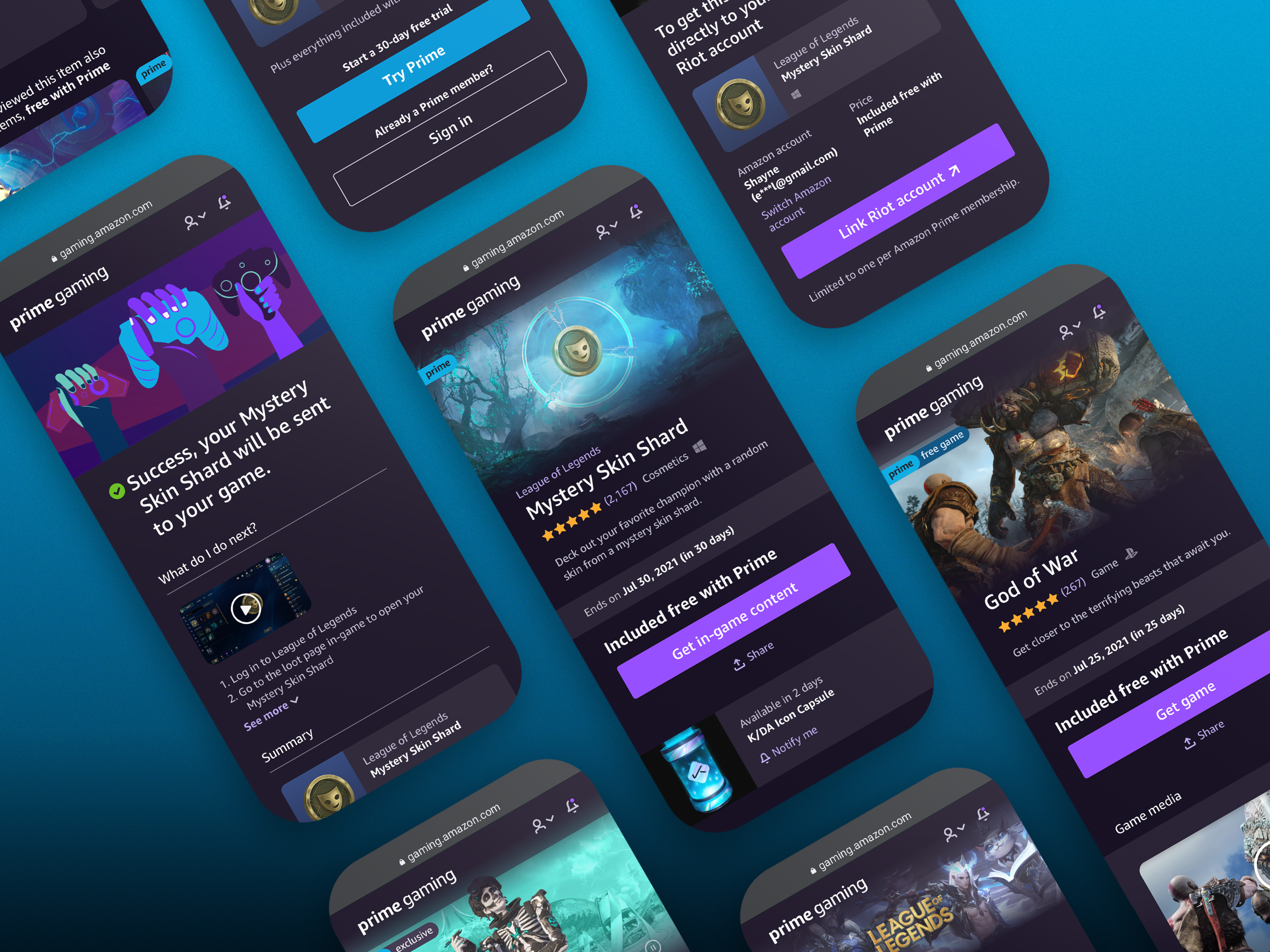
What’s next? Reinvention.
Design is never done. Despite their success for multiple years, there were growing problems with offer detail pages. They lacked consistency and clarity in what you can get (as learned from customer studies), had many non-actionable items that left the page feeling empty, had a claim flow that needed improvement, and the tools used to create them had a substantial operational burden. I sought out to solve these issues and more with my new detail pages to improve the customer experience. Check out that case study.
